Website Design

Six Things Every Web Page Should Have

by blogmistress on October 12, 2011

In order to make your website a marketing tool, you need to make sure it includes elements that help your visitors find what they want and connect with you. These elements should be integrated into a clean design that has lots of white space and is easy to read. Does every page on your website have the following?

  • A goal – this may seem obvious, but it is the best place to start. Every page should have a purpose, a goal that it is to achieve. If a page doesn’t have a goal, it is a distraction.
  • Your phone number – make it easy for people to reach you. Include your phone number in text (so it can be called with a touch from mobile) on every page.
  • Menu – when someone lands on a page, they shouldn’t have to click the back button to get to the last page. They also don’t need to search for how to move to another page. This is the case for every page except landing pages with conversion forms. (We’ll discuss landing pages more in depth in an upcoming post).
  • Social Media Icons – make it easy for your visitors to connect with you on social media with a Facebook Like button, a Twitter Follow button, a LinkedIn button and/or whatever other social media platforms you are using to interact with your customers and potential customers.
  • A link to your blog – you do have a blog don’t you?
  • A call to action – this is how you convert your visitors into leads. This is what your website is all about!

Make your website an effective marketing tool by including what your visitors need and are looking for.


get-a-free-website-analysis


{ 0 comments }

Website Strategy | Content

by blogmistress on September 23, 2011

What goes on the pages, the content, is one of the most important considerations for your website. Of course, different strategies are called for depending on the type of page. Your home page is the front door to your site. It has a different content strategy than your product/service page. However, there are a some content strategy tips that are helpful for all of your pages.

  • Make sure there are no spelling or grammar errors. This may seem nit-picky, but it is important in establishing your credibility.
  • Use white space to draw eyes to valuable pieces of content.
  • Use headlines and images to make sure that certain pieces of information stand out.
  • Use bullet points and numbered lists to make your content easy to read quickly.
  • Include links and bold lettering in your content to help search engines know what is important.
  • Include calls to action (at least 3) above the fold.
  • Optimize around one keyword phrase and make sure that the keyword is in the title and meta description (preferable as the first word).
  • Make your page title less than 70 characters and your meta description less than 150 characters.

The way you present the content on your website matters. It can help you be found by search engines and people. Once people find you, your content can help them navigate your site, see what is important very quickly and get them to take action.

Note: The Website Strategy Seminar is coming up next Tuesday in Mountain Home, Arkansas. If you are in the area, be sure to register.

Your website can be one of the most valuable marketing assets your business owns, so you should make the most of it. The website strategy seminar will help you do that. You will learn:

  • What website mistakes can cost you time and money and headaches you cannot afford
  • How to audit your website to discover its strengths and weaknesses
  • Why your homepage is so important and how to optimize it
  • How to create educational and informative product/services pages
  • How to optimize your website for search engines
  • How to use calls to action to get leads from your website
  • How to integrate social media with your site
  • How mobile marketing can figure into your website strategy
  • How to measure your website’s performance

The internet has changed the way people shop, learn and do business. Businesses have to adapt or risk extinction. This could be one of the most important seminars you attend to help your business succeed online. Don’t miss it.


register-website-strateg


{ 0 comments }

Website Design – The “Above the Fold” Myth

by blogmistress on September 21, 2011

In the beginning

Some web designers hold on to the antiquated idea that information on your website should all be above the fold. This design rule comes from the idea of printed newspapers that are displayed and sold flat. What you see in the display of a newspaper is everything above the fold. What is above the fold is what is supposed to get your attention so you will purchase the newspaper to read the story.

In the early days of the web, back in the late 90′s, web designers took the print rules and applied them online. Of course, then  screens were small and people were not very likely to scroll beyond what was on the screen. Scrolling was even less likely at that time when AOL chopped everything into 800 X 600 displays and then required you to click to the next page to get to more information rather than scroll down.

People have changed the way they view

Things have changed a great deal since those early days of the web. Now, we aren’t only viewing sites on our computer, we are also viewing them on mobile devices and tablets. Screen sizes and screen resolution can vary greatly between different machines and devices, so the above the fold rule just doesn’t make sense anymore. Also, with the popularity of social media sites like Facebook and Twitter, and the explosive growth of blogs and blog readers, most people are very comfortable now with scrolling for more information.

Studies dispel the myth

There have been many studies that have shown that people do indeed scroll which have debunked the myth of the above the fold design. Most notably was a study by CX Partners that was conducted over 6 years where they used eye tracking, user data and click data in over 800 sessions to test the validity of the fold being a barrier. Milissa Tarquini, Director of User Interface Design and Information Architecture at AOL, also took a look at above the fold data which she outlines in her article Blasting the Myth of the Fold. She tells us:

There is an astonishing amount of disbelief that the users of web pages have learned to scroll and that they do so regularly. Holding on to this disbelief – this myth that users won’t scroll to see anything below the fold – is doing everyone a great disservice, most of all our users.

It’s a new world

Unless you are using a separate style for mobile devices (which is recommended), you will find that the above the above the fold design is not particularly mobile friendly. In my own research of looking at above the fold designs on my iPhone, I found that the display crammed all of the information in the top half of the screen while the bottom half of the screen was blank. It was not a good use of the limited amount of space that is available on a mobile device. I have not yet looked at any of these sites on a tablet, but would be interested to see how they are displayed there.

Does the fold ever matter?

The fold is kind of an ambiguous term at this point. As we have already mentioned, the fold on different devices and with different resolutions is hard to even define. However, some consideration should definitely be given as to what is at the top of the screen. What is “above the fold” should be what is most important. It should be the answer to why someone is visiting your site.

People land on your site for a reason. You need to give them a reason to stay. That has always been the case whether you believed people scrolled or not. Include compelling content and calls to action. Always keep the needs of your customer as your most important consideration.


register-website-strateg


{ 0 comments }

For purposes of this post, we will be using the term keywords to refer to words and phrases on a webpage not the words in the “keyword” meta tag.

Marketing Titan says:

Generally, keywords can be defined as a word or words identifying something on a page. More accurately, however, keywords can be defined as the specific terms used by a person to search for something on the internet. In general, you want to identify the phrases being used to search for your product or service and then incorporate those in your Internet marketing.

Keyword Importance

Keywords are important because keywords are what lead people using search engines to your website. So, choosing and using the right keywords on your website is extremely important for higher search engine rankings.

How to Choose Keywords

To choose the right keywords, first analyze your business carefully and think of all the words and phrases that relate to your company, product or service that people may use to find you on the internet. Then, use a keyword tool such as Google’s Keyword Tool to determine which keyword phrases are being searched the most.

After you determine a particular keyword phrase to use on your web page, sprinkle that phrase within the content of that web page. You should not use more than one or two keyword phrases on a web page.

Other places to use your keyword phrase:

  • HTML Page Title
  • Text (content) of the Page
  • Meta Description
  • Meta Keywords
  • ALT Tags
  • URL name

Selecting the wrong keyword phrase or not selecting a keyword phrase at all can cost you dearly in the search engine rankings.


seo-101-ebook


{ 0 comments }

Websites: Design vs. Content

by Admin on September 1, 2011

When you visit a website, what influences you most as to whether you will do business with that company or not? Is it the colors used on the website or the feel it projects? Is it the ease of use of the site or the information it provides?

The answer is . . . it depends. It depends upon the type of business it is. If it is the website of a graphic artist, it may be important to you that she has the same sense of color as you. If you are looking for a wedding planner, you may look for a wedding planner’s website that projects the type of feeling you want at your wedding.

But the truth is that studies have shown that the most important features of websites is information and ease in finding that information (navigation). You can have the best looking website in the world, but if it doesn’t have the information your customers are looking for, or if it does, the information is difficult to find, then it is of no use to your customers.

Many business owners spend way too much time trying to get that exact shade of green they like, only to find out it looks different on every screen out there. Websites are not like print media. You don’t have complete control over color, fonts and font sizes. Colors display differently on every monitor, and most web browsers allow the user to change font and font sizes (not to mention every browser already displays fonts differently). The only thing you really have control over is your content and how visitors to your website find that content.

Do a little research to find out what your customers and potential customers look for in a website. Don’t guess! We often hear people say, “Well, my customers want to see ‘such and such’ when they come to my website”, only to have a little research show that their customers want to see ‘this and that’ instead. Business owners often let their own likes and dislikes influence there decisions when it comes to the look of their website. Don’t guess!

While a website’s attractiveness is important to the branding of your company, it is not the only consideration. The most important thing is that you have what your customers are looking for and they can find it.


get-a-free-website-analysis


{ 0 comments }

lead generating machineIs your website a traditional advertisement for your business or something more?

About.com defines advertising as

the paid, public, non-personal announcement of a persuasive message by an identified sponsor; the non-personal presentation or promotion by a firm of its products to its existing and potential customers.

That sounds like a lot of websites we see. Websites are paid, public promotions by firms of their products to their existing and potential customers. But where websites can and should differ from traditional advertising is websites can be personal. It is possible to have a personal interaction on a website.

Traditional advertising is what we refer to as “outbound” or “interruption” marketing. The traditional advertisement has to interrupt you and gain your attention before it tries to promote its products or services. That’s why we see and hear so many goofy ads. They are trying to gain your attention through silliness.

Websites are examples of “inbound” or “attraction” marketing. Websites are found by people searching for the information they contain. Websites can increase their “attraction” or likelihood of being found by increasing the amount information on them that people are searching for. One of the best ways to do this is through a blog. Each blog post gives your website a new opportunity to be found.

So don’t look at your website as an advertisement. It can and should be so much more. Don’t waste your money or your visitors’ time with silly gimmicks to gain their attention. You already have their attention. Remember they were looking for information and found your website in the process. Give them the information they are looking for.

Make your website a lead generating machine. Let us show you how.


request-a-hubspot-demo


{ 0 comments }

Blog Marketing Can Fuel Your Website

by blogmistress on August 31, 2011

blog marketingGrowing businesses are always looking to acquire new assets and to protect those assets. Often, businesses don’t realize the value of their website as an asset for their business. Many times, especially in small businesses, a website is something that is added as an afterthought and not seen as a valuable part of a marketing strategy.
How you use and protect your assets tells you a lot about how valuable that asset is to you. If you purchase a vehicle for your business, you will probably take good care of it, even though the value of a vehicle certainly depreciates quickly. You definitely wouldn’t purchase a vehicle for your business and then never use it or put gas in it. The purpose of a vehicle is to get you from one point to another. Without fuel the vehicle is useless. If you don’t use the vehicle, it is not serving its intended purpose and has no value.

Why then, do so many business have websites that are not being used as a valuable marketing tool. A website does not depreciate in value like a vehicle does. In fact, the value of a website can appreciate in value if it is used properly. How can you fuel your website and continually be adding value to it? By blogging. Blog marketing is simply adding content to your site on a regular and consistent basis that is of value to your visitors. It also helps you get found by new visitors because it is constantly giving search engines new, fresh material to serve to them.

Don’t neglect what can be one of your best business assets. Use blog marketing to attract more visitors to your site. Use compelling calls to action to convert your visitors into customers, and then, of course, analyze your results and adjust accordingly.

Need help with your internet marketing strategy? Whether it is website design, blogging, or social media, we can help!


contact-us


{ 0 comments }

What Marketers Can Learn From The Grocery Store

by blogmistress on August 30, 2011

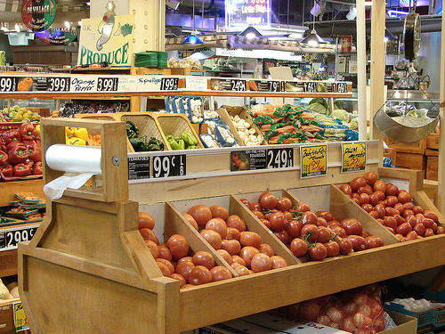
grocery storeYou may have noticed, many grocery stores have similar layouts. The dairy and meat departments tend to be at the back of the store. You have to walk past a lot of other enticing items to get to those mainstay departments. Staple items like salt and flour are usually on lower shelves. Specialty spice blends are placed at eye level. That makes it easier for those items to capture your attention and hopefully go in your cart.

Contrary to what you may have heard, grocery stores don’t do this to trick you, they do it to stay in business. It’s called marketing and it works. Grocery stores typically run on a pretty narrow profit margin so they use everything they can, including layout and design to make it easier for you to buy more.

We can use the same principles in our online marketing efforts. A grocery store wants to “introduce” you to items that you might buy while you are on your way to items you were going to buy anyway. Online, things are different. People are impatient. They want to find things quickly. So, while we can use layout and design to help our marketing efforts, it will be in a very different way.

You may have noticed that, like grocery stores, many websites have similar layouts. Navigation at the top or down the side. Often the navigation will include drop downs or flyouts to make it easier to get where you want to go in fewer clicks. There may also be sidebars where you can find a compelling call to action. The reason so many businesses use similar layouts is the same reason so many grocery stores have similar layouts. It’s called marketing and it works.

There are companies who specialize in grocery store layout. They create layouts and designs that will market products effectively. This gives the grocer a better chance at making a profit and staying in business. There are also companies (like Wharton Marketing) that specialize in web design for effective marketing. Good design gives businesses a better chance at being successful and growing their business.

Look at your own website. How easy is it for visitors to find what they are looking for? How many clicks does it take? Don’t just use your own experience. Get someone outside of your business to try it out. How easily is your site viewed on mobile? What works well and what doesn’t work? Take a lesson from your favorite grocery store and make it easy for people to buy more!


get-a-free-website-analysis


{ 0 comments }

Are Your Marketing Efforts at Risk?

by blogmistress on August 24, 2011

digital sharecroppingWe have talked a lot on this blog about the importance of owning the assets of your business. Too often, business owners rely too much on marketing efforts they do not own. Recently, Sonia Simone of CopyBlogger wrote an article that discusses this very subject. She brings up the term “digital sharecropping” which was coined by Nicholas Carr to describe how this phenomenon works:

One of the fundamental economic characteristics of Web 2.0 is the distribution of production into the hands of the many and the concentration of the economic rewards into the hands of the few.

So, when businesses put all of their efforts into sites like Facebook, they need to understand that Facebook effectively owns their content. So, that begs the question, what happens when you somehow violate the Facebook terms of service or they change the way they allow you to communicate with your friends and fans? As Sonia described it, “The more content we create for free, the more valuable Facebook becomes. We do the work, they reap the profit.”

That doesn’t mean you shouldn’t take advantage of the opportunities provided by sites like Facebook and Twitter and Google +. It does mean, however, that you need to realize that for those sites, you are a sharecropper and the landlord doesn’t know or care who you are.

Ms. Simone suggests that there are three assets (that you own) that you should be concentrating on.

  1. A well-designed website or blog populated with lots of valuable content
  2. An opt-in email list, ideally with a high-quality autoresponder
  3. A reputation for providing impeccable value

It is important to know what online assets you own. It is also important to know that the assets you think you own, such as your website, really are under your ownership. Sometimes, businesses think they own their website, only to find out that their web designer is actually the owner. I have seen it happen too many times. Web designers register your domain in their own name and they then effectively own your website. I’m not sure this is always done maliciously. I know some “web designers” who just don’t know not to do that.

Make sure you own the assets of your business and that they are the ones that you are growing. As digital sharecroppers, we may not survive if we put all our efforts into the sites we are sharecropping and the landlord fails/kicks us out/changes directions.

For those of you in the Twin Lakes area, sign up for the Website Strategy and Planning Seminar. The seminar is on Tuesday, September 27th at the Donald W. Reynolds Library in Mountain Home. Visit the Arkansas Small Business and Technology Development Center website for registration information.


get-a-free-website-analysis


{ 0 comments }

Top 7 Website Design Don’ts

by Admin on August 18, 2011

Today we are going to look at 7 major website design flaws. You’ve seen them, and they drive most of us crazy.

They are:

  1. Lack of Personality
  2. Hard to Read Text
  3. Confusing Navigation
  4. Distracting Design Elements
  5. Auto-Play Media
  6. Trying Too Hard To Be Different
  7. Click To Enter Pages

Lack of Personality. These are sites with little color and most images are stock images. Many technical sites are like this. Don’t go overboard, but do show some of your personality in your site.

Hard To Read Text. These sites have text that is too small or uses a strange font that is difficult to read. Some have background images behind the text which sometimes hides the text.

Confusing Navigation. You’ve been to these sites where navigating them is like going through a maze. And even though you finally find the information you’re looking for, the next time you visit the site you can’t remember how to get to it. Don’t make it difficult for your website visitors to find the information they are looking for.

Distracting Design Elements. Flashing text and ads, anything that distracts from your message should not be on your website.

Auto-play Media. How many times have you gone to a website and sound (music, voices, train wreck) starts blasting out of your speakers. You had been listening to your favorite band on your computer the day before and had the sound turned up. You start looking for the ‘Stop’ button and can’t find it. If you have some kind of media to be played on your site, give visitors a choice to use it. Don’t force it upon them.

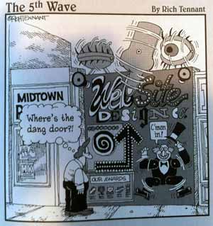
Trying Hard To Be Different. Unless your website caters to a group that requires it to be different, don’t. Most websites are set up similarly the same way most books have a table of contents, chapters and pages. Hiding menu items behind unmarked objects may seem clever, but may be a hindrance for your visitors. Most people visit websites for information, not Easter egg hunts.

Click To Enter Pages. Whether it is a Flash animation or just a static image, Click-to-Enter pages are a roadblock to your website. Why make a visitor wait for 1 second or 2 minutes before entering your site to get the information she is looking for? As with Auto-play media, you are forcing your visitor to do something they didn’t choose to do. If your Flash animation is so important, give your website visitor the choice to watch it.

These are just a few of the no no’s in website design. Let us know the ones that bother you.


get-a-free-website-analysis


{ 0 comments }